Stepper/Spinner UI Control Document
Author: Jindrich Dinga
Last Update: Oct 18th, 2011
Please note that all pictures that are shown in this document are for illustration purposes only.
Table of Contents
1 Overview
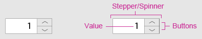
Stepper, which may also be known as Spinner, is a control that allows users to change incrementally the value within its associated field. Next to the field that holds the value, there are two buttons that change the value within the field upon click.
This control is usually used in forms, however, its equivalent can also be used for e.g. entering a date into DatePicker control (see Stepper/Spinner control on touch devices). Even though this control is mainly used for numeric values (this control is sometimes called as Numeric Stepper) other values, such as text or images, should be supported too.
The following image shows overview of Stepper/Spinner control.
Figure 1 Stepper/Spinner overview
2 Interaction Design
2.1 Basic Functionality
In normal state, Stepper/Spinner's field may contain a predefined value. Once the field gets focus, users are able to increase or decrease its value by one step by pressing the appropriate buttons. If users keep one of the buttons pressed, the value in the field increases or decreases automatically until users release the button or maximum or minimum value, if applicable, is reached.
Figure 2 Stepper/Spinner (in editable mode)
with focus
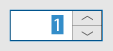
Please note that buttons used in Stepper/Spinner control have, as other buttons, normal, over, and press states.
2.2 Additional Functionality
Apart from the basic functionality, Stepper/Spinner control also offers additional functionality that application developers may need.
Editable vs non-editable Spinner/Stepper
Application developers MUST be able to choose whether Stepper/Spinner is editable or non-editable. If Stepper/Spinner is editable (value is highlighted when the field has focus), users are allowed to type a legal value directly into the field. This behavior is especially useful in case users are required to enter a number, e.g. age, into the field. On the other hand, in case Spinner/Spinner holds a text value, e.g. days of the week, application developers may not want Stepper/Spinner to be editable.
Please note that there must be a validation of all values entered into the field. If an incorrect value is entered, an inline error message should appear along with highlighting Stepper/Spinner in a color (i.e. red). Placement of this error message is solely up to developer of the application. Another option how to handle incorrect values in the field is simply not to accept them. In such case, a sound should indicate that an incorrect value was entered.
Steps, units, and limits
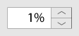
Apart from specifying type of the value, application developers MUST be able to specify the step which the value is increased or decreased by. In addition to that, application developers MUST be able to specify if unit (aka prefix; e.g. %) of the value should be visible in the field.
Figure 3 Stepper/Spinner showing an unit
Also, application developers MUST be able to specify min and/or max limits, if applicable, for the value that is being displayed in Stepper/Spinner's field.
Layout and location of step buttons
Application developers MUST be able to specify position where the buttons will appear.
Location of step buttons can be as follows:
- both buttons are located on the right side of the field
- this is the default position
- both buttons are located on the left side of the field
- it might be a request from developers working on applications for mid-east consumers
- please note that there might be a request for text alignment changes too
- each button is on one side of the field (horizontal placement)
- might be suitable for non-editable spinner/stepper that contains text
- more likely for touch platforms only
- each button is on one side of the field (vertical placement)
- more likely for touch platforms only
Figure 4 Various positions of step
buttons

Step buttons' appearance
Application developers MUST be able to specify/change images that are displayed on the step buttons. By default, there are UP and DOWN arrows displayed on the buttons.
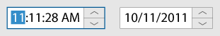
Time/Date Stepper/Spinner
It WOULD BE NICE if Stepper/Spinner control allows application developers to show time or date. In such case, when Stepper/Spinner gets focus only first part of the time or date is highlighted. Users can type a new value, which needs to be validated, or change the value by using UP or DOWN arrow keys; to move to another part of the time or date, users need to press LEFT or RIGHT arrow keys or click the part they want to edit.
Figure 5 Stepper/Spinner shows time or
date
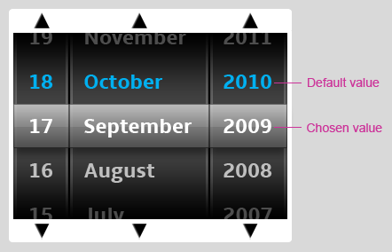
Stepper/Spinner on touch platforms
Even though the design of Stepper/Spinner control, which has been described above, should be sufficient for touch platforms, it WOULD BE NICE if application developers are provided with another design they can choose from.
Figure 6 Appearance of Stepper/Spinner on touch
platforms
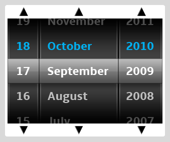
In such control, users are supposed to swipe their finger across a part of Stepper/Spinner control from:
- top to bottom to increase the value or from
- bottom to top to decrease the value.
The value that is in the middle of the control is the chosen/selected value. Please note that default values should be shown in a different color.
Figure 7 Stepper/Spinner for touch platform
overview
3 Navigation
3.1 Mouse Support
The following table describes actions that are performed when users click on:
| Button | Action |
|---|---|
| UP arrow | Increase the value by one step. |
| DOWN arrow | Decrease the value by one step. |
| LEFT arrow | If horizontal placement of step buttons is supported, pressing Left arrow key decreases the value by one step. |
| RIGHT arrow | If horizontal placement of step buttons is supported, pressing Right arrow key increases the value by one step. |
3.2 Touch Support
The following table describes actions that are performed when users tap on:
| Button | Action |
|---|---|
| UP arrow | Increase the value by one step. |
| DOWN arrow | Decrease the value by one step. |
| LEFT arrow | If horizontal placement of step buttons is supported, pressing Left arrow key decreases the value by one step. |
| RIGHT arrow | If horizontal placement of step buttons is supported, pressing Right arrow key increases the value by one step. |
In case another design for touch platform is implemented:
| Swipe | Action |
|---|---|
| From TOP to BOTTOM | Increase the value. Values change with a smooth animation and momentum. |
| From BOTTOM to TOP | Decrease the value. Values change with a smooth animation and momentum. |
3.3 Directional Keys + OK/Select Support
The following table describes actions that are performed when users navigate to the Stepper/Spinner using the arrow keys and press OK/SELECT:
| Keystroke | Action |
|---|---|
| UP arrow | Increase the value by one step. |
| DOWN arrow | Decrease the value by one step. |
| LEFT arrow | Move the insertion point to the left within the
Stepper control's text field if allowed.
If horizontal placement of step buttons is supported, pressing Left arrow key decreases the value by one step. |
| RIGHT arrow | Move the insertion point to the right within the
Stepper control's text field if allowed.
If horizontal placement of step buttons is supported, pressing Right arrow key increases the value by one step. |
3.4 Keyboard Support
The following table describes how keystrokes should be processed in case Stepper/Spinner has focus:
| Keystroke | Action |
|---|---|
| UP arrow | Increase the value by one step. |
| DOWN arrow | Decrease the value by one step. |
| LEFT arrow | Move the insertion point to the left within the
Stepper control's text field if allowed.
If horizontal placement of step buttons is supported, pressing Left arrow key decreases the value by one step. |
| RIGHT arrow | Move the insertion point to the right within the
Stepper control's text field if allowed.
If horizontal placement of step buttons is supported, pressing Right arrow key increases the value by one step. |