DatePicker UI Control Document
Last Update: Oct 5th, 2011
Please note that all pictures that are shown in this document are for illustration purposes only.
Table of Contents
1 Overview
DatePicker is a control that allows users to easily select a date from a given calendar. It is mainly used on web sites or in applications that require users to enter a date. DatePicker control usually consists from DateField, which may or may not be occupied with an icon, and DateChooser.
The following image shows overview of DatePicker control.
Figure 1 DatePicker overview 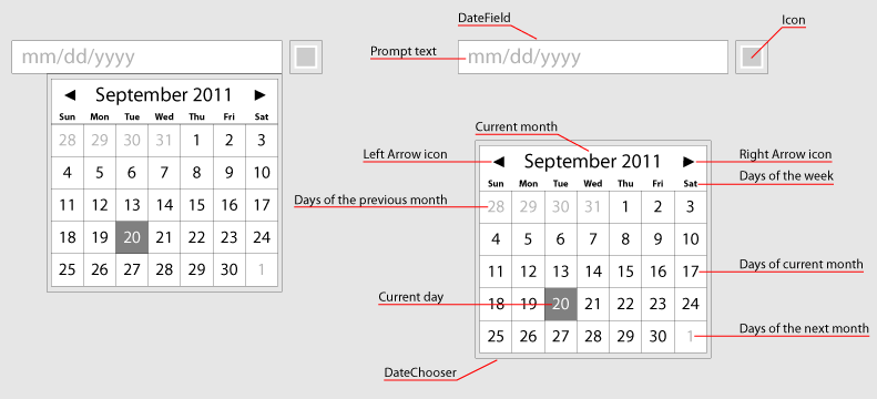
2 Interaction Design
2.1 Basic Functionality
In normal state, there is a prompt text displayed in DateField in order to show required format of the date. From accessibility point of view, this prompt text is especially important when users enter the date into DateField by using keyboard and not by choosing the date from DateChooser.
Please note that in case the date is entered in an incorrect format, an inline error message should appear along with highlighting DateField in a color (i.e. red). Placement of this error message is solely up to developer of the application.
Figure 2 Example of DateField with default
prompt text

Immediately, when DateField gets focus DateChooser pops-up (with an animation) in order to allow users to select the date by using their mouse. Upon selecting the date, DateChooser is closed and the selected date is displayed in DateField.
Figure 3 DatePicker control
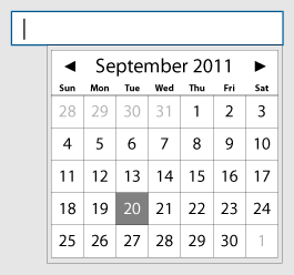
If users type date into DateField, DateChooser automatically updates based on entered data.
Please note that in DateChooser all days have the following states: normal, over, press, and selected. Current day and month should be visually differentiated from regular days.
2.2 Additional functionality
Apart from the basic functionality, DatePicker control also offers additional functionality that application developers may need.
Different date formats
Application developers MUST be able to choose format of the date that fits their needs. These formats are as follows:
Figure 4 Date formats| prompt text: mm/dd/yyyy (default) | prompt text: mm/dd/yy | prompt text: yyyy-mm-dd |
 |
 |
 |
| prompt text: yyyy/mm/dd | prompt text: Day, dd Month, yyyy | |
 |
 |
Please note that if a day or month starts with "0", the "0" does not have to be entered.
DateChooser behavior
Application developers MUST be allowed to change the behavior of DateChooser in such way so it pops-up only upon clicking the calendar icon or stays visible all the time.
Figure 5 DatePicker control - DateField along
with the calendar icon
![]()
Date range restriction
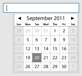
Application developers MUST be allowed to disable certain dates in DateChooser.
Figure 6 Date range restriction (Sat & Sun
disabled)
Position of DateChooser
Application developers MUST be allowed to specify where DateChooser should pop-up. By default, DateChooser pops-up right below DateField, aligned to right.
Localized DateChooser
Application developers MUST be allowed to choose language in which DateChooser should be displayed.
Multiple months
In DatePicker control, there should be a possibility for application developers to choose how many months DateChooser SHOULD display. The default number of months displayed in DateChooser is "1".
Figure 7 DateChooser shows two months

After pressing the left arrow icon previous month slides out and pushes all months to right. Similarly, after pressing the right arrow icon next month slides out and pushes all months to left.
Time
In some cases, there might be a need from application developers to get a time stamp from users. If so, application developers SHOULD be allowed to enable showing controls that allow users to enter the time into DateField. The time is added right after the date.
The following pictures show basic date formats along with time.
Figure 8 Date formats along with time| prompt text: mm/dd/yyyy hh:mm:ss | prompt text: mm/dd/yy hh:mm:ss |
 |
 |
| prompt text: yyyy-mm-dd hh:mm:ss | prompt text: yyyy/mm/dd hh:mm:ss |
 |
 |
| prompt text: Day, dd Month, yyyy hh:mm:ss | |
 |
In addition to the time, it WOULD BE NICE if application developers would be allowed to enable showing the time zone drop down in DateChooser.
Figure 9 DateChooser along with time and time
zone controls
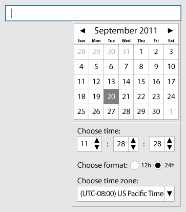
Please note that if users select 12h time format, AM or PM appends the time that is displayed in DateFiled, e.g.11:28:28AM.
Week starts on [day]
By default, the week starts on Sunday, but application developers SHOULD be allowed to change it according to their needs.
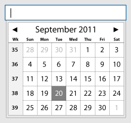
Weeks of the year
It WOULD BE NICE if application developers are able to enable showing weeks of the year in DateChooser.
Figure 10 DateChooser with weeks of the
year
Today button
It WOULD BE NICE if application developers are able to enable showing Today button in DateChooser. By pressing that button, DateChooser would change its view to show the current date. Today button is placed right below the calendar; aligned to left.
Figure 11 DateChooser with Today button

Pictures in DateChooser
It WOULD BE NICE if application developers are able to customize DateChooser in such way, so images are displayed there. It should be possible to display static images as well as images that are taken from a server.
Figure 12 DateChooser with an image

DateChooser on touch platforms
Even though the design of DateChooser, which has been described above, should be sufficient for touch platforms, it WOULD BE NICE if application developers are provided with another design they can choose from.
Figure 13 Appearance of DateChooser on touch
platforms
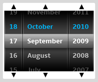
In such control, users are supposed to swipe their finger across a part of DateChooser control from:
- top to bottom to increase the value or from
- bottom to top to decrease the value.
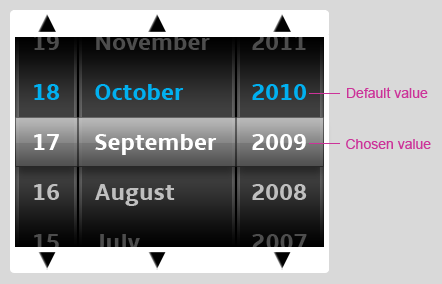
The value that is in the middle of the control is the chosen/selected value. Please note that default values should be shown in a different color.
Figure 14 Stepper/Spinner for touch platform
overview
Animations
This chapter shows some basic animations of how DateChooser pops-up once DateField gets focus.
Flash movie 1 SlideIn/SlideOut effect
Flash movie 2 SlideRight/SlideLeft effect
Flash movie 3 FadeIn/FadeOut effect
Apart from these basic effects mentioned above, application developers SHOULD be allowed to create their own effects for poping-up DateChooser.
3 Navigation
3.1 Mouse Support
The following table describes actions that are performed when users click on:
| Action | |
|---|---|
| DateField or Icon | Display DateChooser. |
| LEFT arrow | If DateChooser is open, go to the previous month. |
| RIGHT arrow | If DateChooser is open, go to the next month. |
| Day | If DateChooser is open, close DateChooser and update DateField with the selected date. |
| Outside DateChooser | Close DateChooser without updating DateField. |
3.2 Touch Support
The following table describes actions that are performed when users tap on:
| Action | |
|---|---|
| DateField or Icon | Display DateChooser. |
| LEFT arrow | If DateChooser is open, go to the previous month. |
| RIGHT arrow | If DateChooser is open, go to the next month. |
| Day | If DateChooser is open, close DateChooser and update DateField with the selected date. |
| Outside DateChooser | Close DateChooser without updating DateField. |
In case another design of DateChooser for touch platform is implemented:
| Gesture | Action |
|---|---|
| Swipe TOP to BOTTOM | Increase the value. Values change with a smooth animation and momentum. |
| Swipe BOTTOM to TOP | Decrease the value. Values change with a smooth animation and momentum. |
3.3 Directional Keys + OK/Select Support
The following table describes actions that are performed when users navigate to DateField using the arrow keys:
| Keystroke | Action |
|---|---|
| OK/SELECT | If focus is in DateField, perform default
action. If focus is in DateChooser, update DateField with the selected date and/or time and close DateChooser. |
| UP arrow | Move focus to DateChooser if open above
DateField. If focus is in DateChooser, move focus up by one item. |
| DOWN arrow | Move focus to DateChooser if open below
DateField. If focus is in DateChooser, move focus down by one item. |
| LEFT arrow |
Move the insertion point to the left within DateField if
applicable. Move focus to DateChooser if open on left side of
DateField. If focus is on a day in DateChooser, move focus to the previous day. If focus is on the first day of a month, move focus to the last day of previous month. In addition, update name of the month and its days. |
| RIGHT arrow |
Move the insertion point to the right within DateField if
applicable. Move focus to DateChooser if open on right side of
DateField. If focus is on a day in DateChooser, move focus to the next day. If focus is on the last day of a month, move focus to the first day of next month. In addition, update name of the month and its days. |
3.4 Keyboard Support
The following table describes how keystrokes should be processed in case DateField has focus:
| Keystroke | Action |
|---|---|
| ESC | If DateChooser is open, close DateChooser without updating DateField. |
| ENTER | If focus is in DateField, perform default
action. If focus is in DateChooser, update DateField with the selected date and/or time and close DateChooser. |
| SPACE | If focus is in DateChooser, select focused date and update DateField. |
| UP arrow | Move focus to DateChooser if open above
DateField. If focus is in DateChooser, move focus up by one item. |
| DOWN arrow | Move focus to DateChooser if open below
DateField. If focus is in DateChooser, move focus down by one item. |
| LEFT arrow |
Move the insertion point to the left within DateField if
applicable. Move focus to DateChooser if open on left side of
DateField. If focus is on a day in DateChooser, move focus to the previous day. If focus is on the first day of a month, move focus to the last day of previous month. In addition, update name of the month and its days. |
| RIGHT arrow |
Move the insertion point to the right within DateField if
applicable. Move focus to DateChooser if open on right side of
DateField. If focus is on a day in DateChooser, move focus to the next day. If focus is on the last day of a month, move focus to the first day of next month. In addition, update name of the month and its days. |
| TAB | Moves focus to the next focusable control. |
| SHIFT - TAB | Moves focus to the previous focusable control. |
For keyboard support of controls used in DatePicker control, please see the appropriate UE specs.
