JEP draft: Add a JDatePicker UI Component to the Swing UI Toolkit (Preview)
| Owner | Tejesh R |
| Type | Feature |
| Scope | SE |
| Status | Submitted |
| Component | client-libs / javax.swing |
| Discussion | client dash libs dash dev at openjdk dot org |
| Effort | M |
| Duration | M |
| Reviewed by | Kevin Rushforth, Philip Race, Prasanta Sadhukhan |
| Created | 2025/09/29 13:55 |
| Updated | 2026/02/02 15:53 |
| Issue | 8368874 |
Summary
Add to the Swing UI toolkit a JDatePicker component which has an intuitive UI, an easy-to-use API and supports a wide range of common use cases, such as picking a single day or range of days from a month calendar.
This is a Preview API (see https://openjdk.org/jeps/12)
Goals
- Provide a Date Picker component which allows a user to select a java.time.LocalDate, either by picking it in the UI, or entering a date directly into a validated formatted entry field.
- Support user selection of year, month and day.
- Provide APIs which allow the application to configure the behavioral parameters of the component. For example, to constrain the java.time.LocalDate range which is available to the user, and to pre-select a date.
- Provide APIs which allow the application to configure or customise certain visual aspects of the component. For example, show/hide week number, layout, colors, fonts, custom cell rendering.
- Have an API design that is consistent with the Swing MVC pattern used for other components and conform to the current Swing LookAndFeel to the same extent as existing standard Swing components.
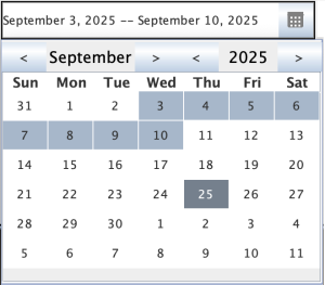
- Support use cases such as selecting a date range as a pair of java.time.LocalDate instances, either directly, or by making it easy to use two co-operating DatePickers, where one represents the earlier date, and the other represents the later date.
- Enable the component to be embedded in a Swing/AWT Container, or used as a pop up.
- Internationalize the component thereby allowing localization. Provided localizations will be the same as for other Swing components.
- Support the Swing Accessibility APIs so the Date Picker can be used by existing Assistive Technologies.
Non-Goals
- Providing built-in capability for time selection within a day.
- Supporting non-Gregorian calendar systems.
Motivation
- Many UI applications have a need to allow the user to select a date, or a range of dates.
- Swing has a rich set of UI components but lacks such a Date Picker.
- The need for this in Swing was recognised a long time ago and there was a prototype in the now abandoned SwingX project.
- The continued need for this is demonstrated by applications resorting to 3rd party solutions. These have various limitations.
- Swing developers have indicated, in response to the proposal : Seeking feedback on a possible JDatePicker Swing component that if a DatePicker with required features were available as a standard Swing component that they would adopt it.
Description
The proposal is to add new public APIs under the javax.swing package hierarchy in the java.desktop module. These APIs will provide a JDatePicker UI component which allows a user to select a date from a calendar view.
The core components of the JDatePicker are:
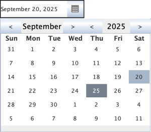
- A JTextField to display a selected date or provide provision to enter a valid date.
- A drop down button to open a calendar popup.
- A calendar popup that displays a Month view of a calendar, with Year and Month clickable labels, and navigation buttons for Year/Month navigation.
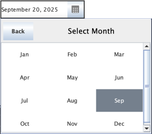
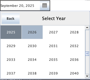
- A Month and Year Selection Panel that will display upon clicking the Month and Year labels respectively.
The Date Picker is designed to be either embedded in a container or to be used via a popup dialog API. A user selected date from the calendar view is copied to the textfield provided by Date Picker, and vice versa. Both are initialized with an initial value, which is either set by the application or by a default date which is the current date. The calendar view is always a month view and supports display of year, month, weeks, and days of the week. Forward and backward navigation buttons provide navigation through Month or Year. Current Month or Year can be selected using an appropriate panel which will open up when clicking on the Month or Year Label.
The Calendar view is application extensible and customizable, using a provided AbstractCalendarPanel .
A DateSelectionModel interface is provided which defines methods for handling selection of a date or dates and also supports event listeners to be notified when a date is selected.
JDatePicker provides a BasicCalendarPanelUI class for date selection.
JDatePicker provides APIs to
- Set an initial selected date, and also to get the selected date(s).
- Get the Date selection model and also to set a custom selection model.
- Set a custom date selection calendar panel.
- Configure parameters such as the initial date, the locale to be used for display, and a DateTimeFormatter.
- Show/hide week number display in calendar panel.
Sample code references:
Set single selection mode and get a date:
JDatePicker datePicker = new JDatePicker();
 datePicker.getCalendarPanel().getDateSelectionModel().addChangeListener(e -> {
       LocalDate date = datePicker.getDate();
       System.out.println("Selected date : " + date);
 });
Set range selection mode and get range of date(start and end range):
JDatePicker datePicker = new JDatePicker();
 datePicker.setDateSelectionMode(DateSelectionModel.SelectionMode.RANGE_SELECTION);
 datePicker.getCalendarPanel().getDateSelectionModel().addChangeListener(e ->  {
        SortedSet<LocalDate> dates = datePicker.getDates();
        System.out.println("Start date : " + dates.getFirst());
        System.out.println("End date : " + dates.getLast());
 });
Set initial date through API:
JDatePicker datePicker = new JDatePicker();
datePicker.getCalendarPanel().setDate(LocalDate.of(2025, Calendar.JULY + 1, 25));
Set year selection scroll limit to 200 years before current year and 200 years after current year:
JDatePicker datePicker = new JDatePicker();
datePicker.getCalendarPanel().setYearSelectionLimit(200);
Set text field formatter:
JDatePicker datePicker = new JDatePicker();
datePicker.setTextFieldFormatter(DateTimeFormatter.ISO_WEEK_DATE);
UI references:
- JDatePicker component UI with TextField and Popup Button

- Calendar panel with single date selection.
- Month selection panel which allows user to select a month directly from a panel
- Year selection panel which allows user to select a year directly from a scrollable panel
- Date range selection
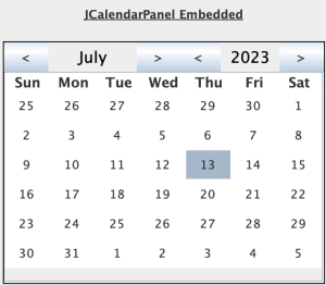
- Embedded Calendar Panel
Alternatives
- User/Developer builds a custom DatePicker component using existing Swing components.
- Use existing DatePicker libraries, like
- JXDatePicker library which is part of now abandoned SwingX project.
- Some 3rd party libraries are available which may have various limitations like non-uniform Look and Feel, complex API, etc.
Testing
New tests will be created to test this new Swing component, these tests include but are not limited to:
- Tests to verify the calendar pop up.
- Tests to verify the TextField is always updated to a date selected in the calendar panel.
- Tests to verify that entered Date in TextField is highlighted in calendar panel.
- Test to verify that month navigation through navigation button works for one click per month.
- Test to verify that Year navigation through navigation button works for one click per year.
- Test to verify that selected date is highlighted with cell background when user clicks a date on calendar panel.
- Test to verify that month selection panel opens up when month label is clicked.
- Test to verify that year selection panel opens up when year label is clicked.
- Test to verify selected month in month selection panel is set to calendar panel.
- Test to verify year navigation is happening on scroll pane of year selection panel and also with navigation buttons.
- Test to verify selected year in year selection panel is set to calendar panel.
As a demonstration, SwingSet2 will be enhanced to have a Date Picker tab.